
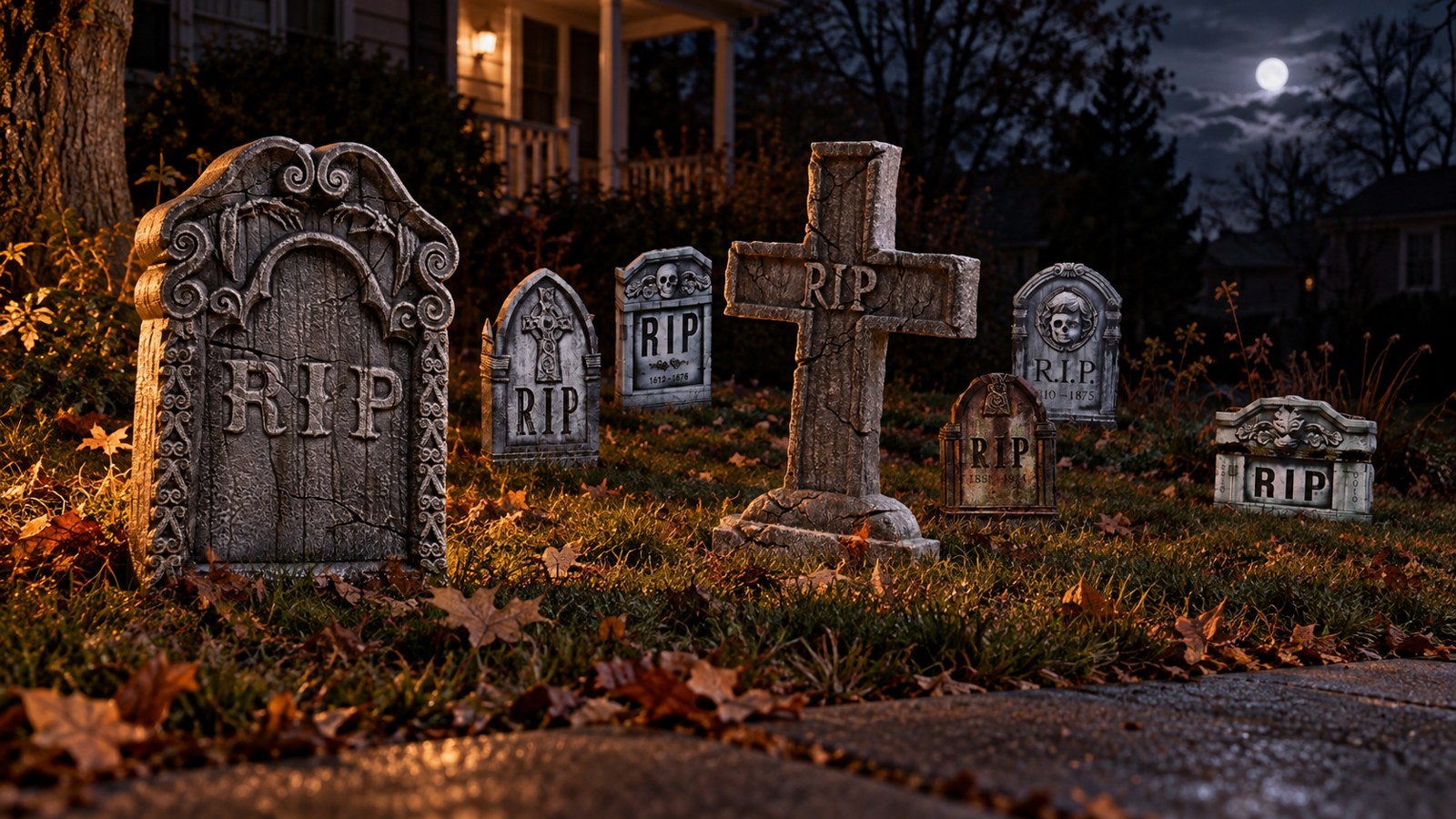
A realistic Halloween tombstone does not look as though it was placed on the lawn five minutes ago. It looks heavy, old, weathered, and connected to the ground around it.
The short answer: believable proportions, visible thickness, uneven stone color, recessed-looking lettering, a partially buried base, irregular spacing, and low side lighting make a Halloween tombstone look real. The most common mistake is treating every marker as a separate decoration. A convincing graveyard feels like one environment.
You do not need a huge budget or a dozen elaborate props. Three well-placed tombstones can look more convincing than twenty identical markers standing in a straight line. If you are prioritizing purchases, see which Halloween products make the biggest difference under $250.
Halloween Tombstone Realism at a Glance
| Detail | What looks believable | What breaks the illusion |
|---|---|---|
| Shape | Several related silhouettes and periods | Every marker has the same shape |
| Scale | Markers large enough to read as grave monuments | Tiny pieces floating in an open lawn |
| Thickness | A visible side edge and solid profile | Paper-thin fronts facing the street |
| Surface | Matte, mottled color with darker recesses | One flat coat of clean gray paint |
| Lettering | Carved-looking names, dates, symbols, or epitaphs | Bright printed words sitting on the surface |
| Placement | Uneven rows with varied depth and angle | A perfectly straight retail-display line |
| Ground contact | Base hidden by soil, leaves, grass, or low fog | Plastic stakes and clean bottom edge exposed |
| Lighting | Low, angled light that reveals texture | Bright front light that flattens everything |
| Story | Consistent age, neglect, and cemetery details | Unrelated props competing for attention |
1. Start With the Shape and Proportions
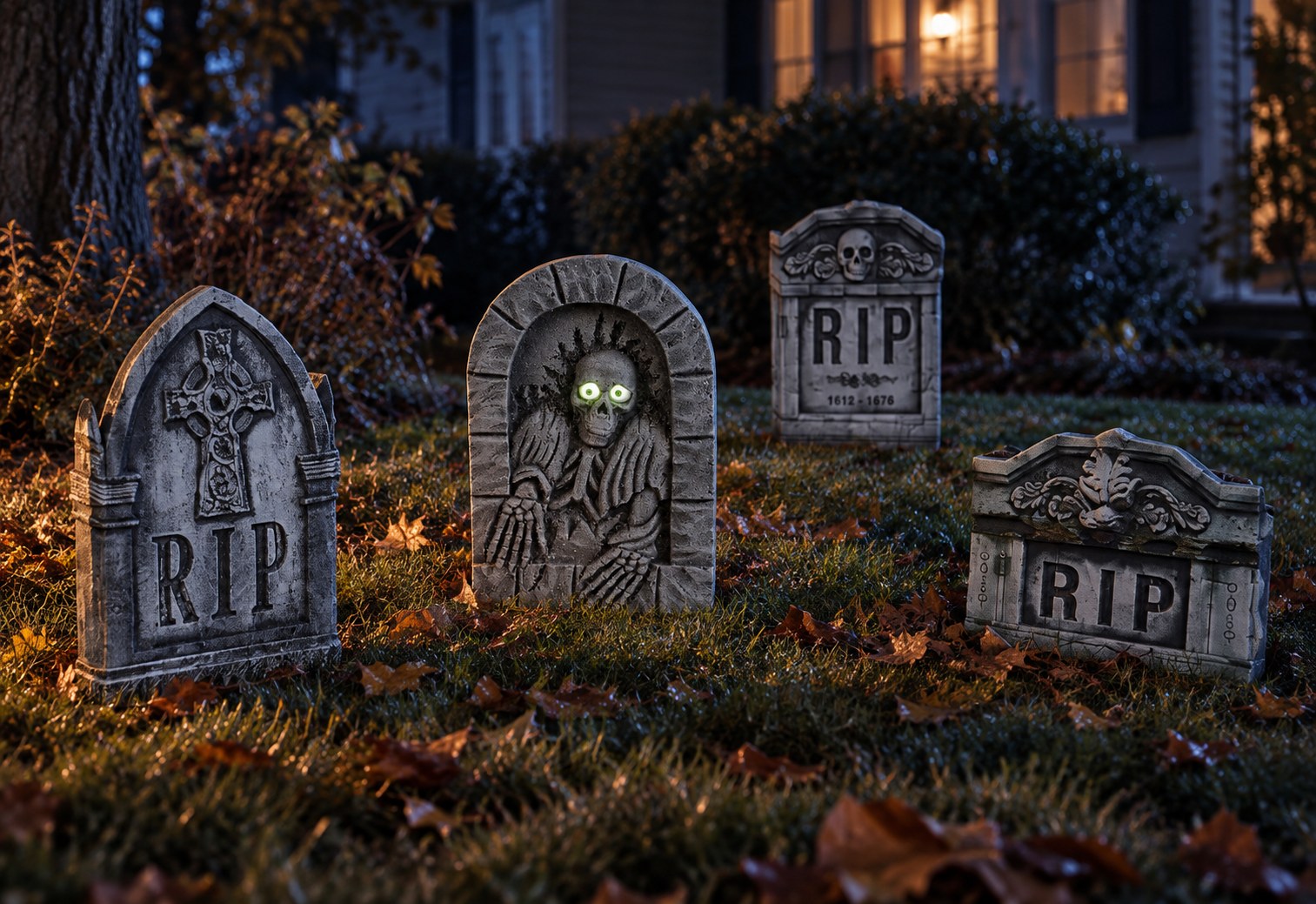
Real cemeteries rarely contain one repeated silhouette. They develop over decades, and marker styles change. Rounded tablets, crosses, taller monuments, low stones, and family markers create a visual history.
That does not mean every tombstone should be wildly different. The strongest graveyards use controlled variety: perhaps one tall cross, two broad tablets, and several smaller background stones. Keep the materials and weathering related so they still appear to belong in the same place.
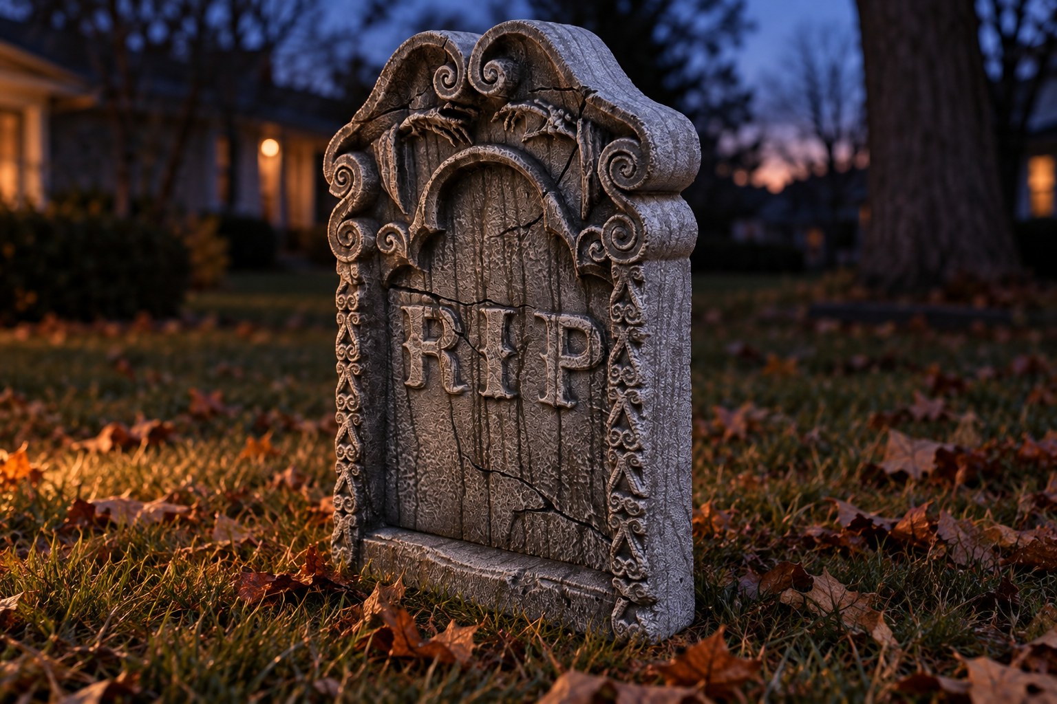
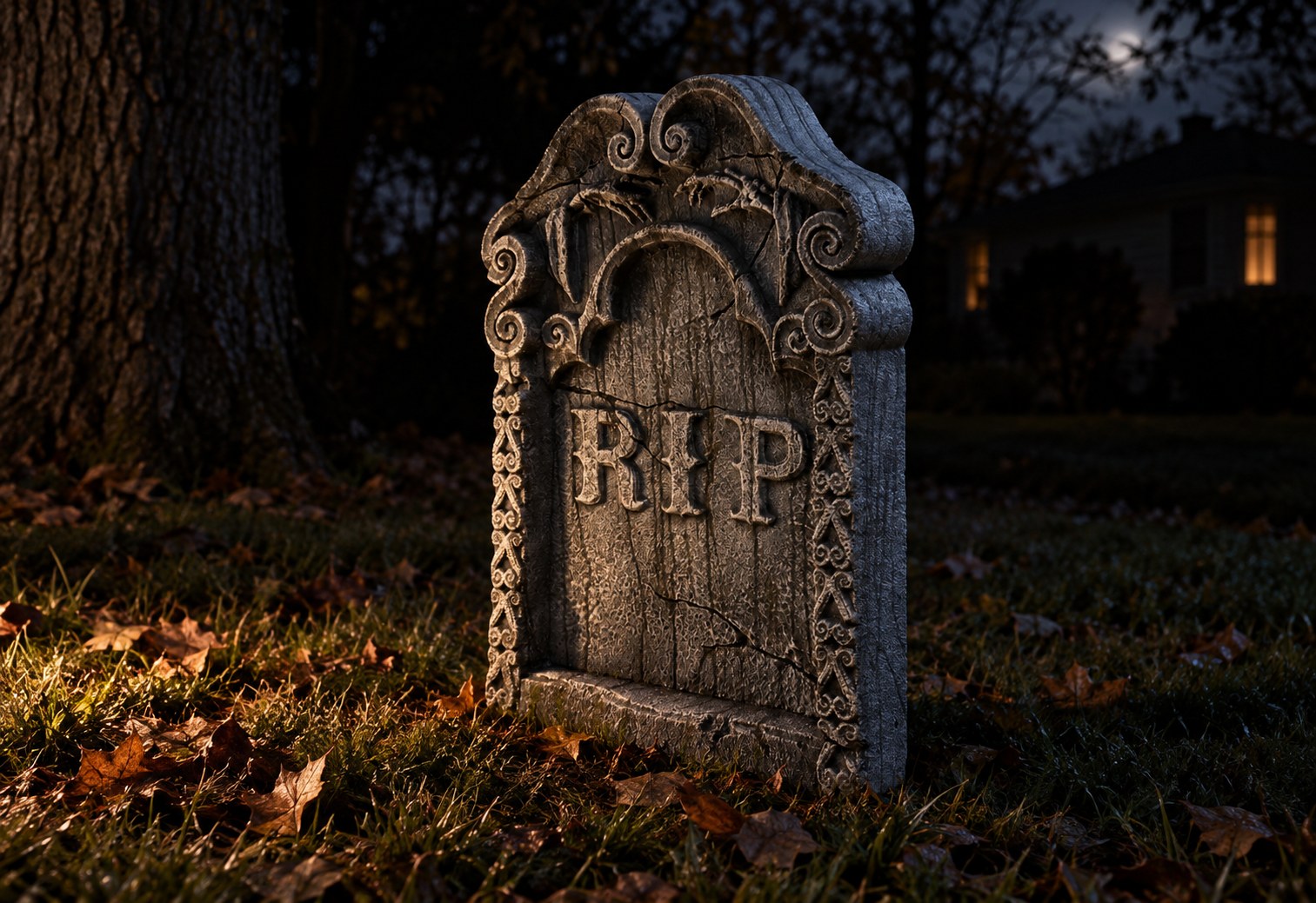
Size matters just as much as shape. A tombstone that is too small may look like a lawn sign, especially when it is isolated in a large front yard. The RIP Tombstone from The Horror Dome is 30 inches tall, 22 inches wide, and 4 inches deep. Those proportions give it enough face area and visible side depth to work as a foreground marker without becoming difficult to store.
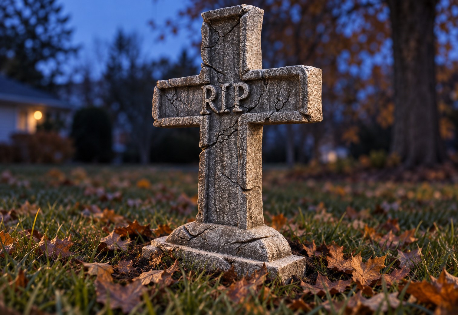
For a slightly smaller companion, the RIP Cross Tombstone measures 24 inches tall, 16 inches wide, and 3 inches deep. Pairing two sizes immediately feels more natural than repeating one marker across the entire yard.
Use forced perspective in a small yard
Place the largest tombstones closest to the sidewalk or viewing path and smaller markers farther back. The size change makes the graveyard appear deeper than it is.
Do not make the progression too perfect. Offset the stones and leave different gaps between them. The goal is depth, not a classroom demonstration of perspective.
2. Thickness Is One of the Biggest Realism Signals
A real grave marker has mass. Even when the front is the most decorative surface, the side edge tells your eye that the object is stone.
This is why thin foam cutouts often look good straight on but fail when guests approach from an angle. If your display can be viewed from the sidewalk, driveway, or both, test every important tombstone from all three positions.
Look for:
- A side profile that remains visible after dark
- A base wide enough to meet the ground naturally
- Crisp silhouette edges without warped corners
- Enough depth to cast a small shadow under side lighting
- A back that can be concealed if it is less detailed than the front
Both the RIP Tombstone and RIP Cross are described as lightweight polystyrene markers with weathered-stone finishes and included ground stakes. Their 4-inch and 3-inch depths help create a more dimensional profile while keeping them manageable for a home display.
Lightweight is useful, but it changes installation. Stakes should hold the prop; they should not become part of the picture. Hide exposed hardware with grass, leaves, mulch, loose soil-colored fabric, or another removable scenic layer. Follow the product instructions, and bring lightweight pieces inside when weather or wind exceeds what the setup can safely handle.
3. Real Stone Is Never Just One Flat Gray
At a distance, old stone reads as gray. Up close, it contains layers: warm gray, cool gray, charcoal recesses, pale mineral marks, dirt near the base, and irregular discoloration from age and water.
The secret is variation without obvious brush patterns. A convincing finish usually has:
- A matte overall surface
- Two or three closely related stone tones
- Darker color in lettering, cracks, and low areas
- Lighter dry-brushed highlights on raised edges
- Slightly heavier staining near the bottom
- Uneven wear rather than a repeated sponge pattern
Avoid pure black shadows and bright white highlights across the entire piece. High contrast can look theatrical in daylight. Save the strongest contrast for the areas guests need to read after dark.
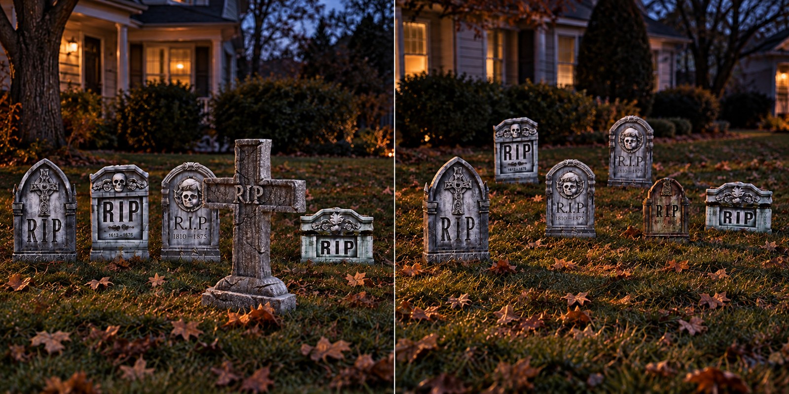
If you prefer a finished set instead of repainting individual markers, the Photo-Realistic Tombstone Halloween Decorations Set includes five different designs: three 22-inch stones and two 18-inch stones. The pieces fold for setup and storage. Because the set already supplies different faces and sizes, it is a practical starting point for a layered graveyard.
Inspect any purchased prop before altering it, and check the seller's return terms. Paints, adhesives, sealers, and artificial moss may not be compatible with every foam or plastic surface.
4. Lettering Must Look Carved Into the Stone
The inscription is usually where a Halloween tombstone reveals itself as a prop. Realism drops quickly when the words appear printed on top, every letter is perfectly clean, or every stone says only “RIP.”
Carved-looking lettering needs depth. The letters should catch shadow on one side and a small highlight on the other. A dark wash inside the recess can make shallow sculpting read more clearly under low light.
For a more convincing cemetery, vary the information:
- A surname on a larger family marker
- A first and last name with dates
- A short, restrained epitaph
- A cross, wreath, ivy, or other period-appropriate symbol
- One damaged or partly unreadable inscription
Do not make every epitaph a joke if the goal is realism. One humorous stone can be a fun discovery. Ten jokes in a row turn the scene into a sign display.
Products such as the RIP Tombstone and RIP Cross use chiseled-looking central lettering and weathered surfaces. They can serve as visual anchors, while less readable markers sit deeper in the yard.
5. Make Every Tombstone Touch the Ground
This is the fastest improvement most home haunters can make.
A tombstone placed on top of freshly cut grass looks weightless. A tombstone whose lower inch disappears into dead leaves, uneven grass, loose dirt, vines, or low fog appears to have occupied that spot for years.
You do not need to dig up the lawn. Build a removable ground-contact layer with materials appropriate for the location:
- Dry leaves gathered safely away from heat sources
- Dark mulch in shallow removable trays
- Artificial moss used sparingly
- Tufts of longer grass around the rear and sides
- Small roots, twigs, or branches placed where guests cannot trip
- Thin low-lying fog that moves across the bases
Keep pathways clear and preserve access to stakes, battery compartments, and controls. Never pile dry landscape material against hot lights, electrical connections, or equipment that is not approved for that use.
Add age where nature would add it
Heavier staining belongs near the ground, inside deep letters, below ledges, and in protected corners. Moss and dirt should not be distributed evenly. Think about where water would collect and where sunlight would be blocked.
Random placement is not the same as natural placement. Give each mark a reason.
6. Arrange the Graveyard Like a Place, Not a Product Line
Begin by choosing the main viewing direction. For most homes, it is the sidewalk or street. For a walkthrough haunt, it is the guest path.
Then build in three layers:
- Foreground: one or two larger markers with the strongest texture and readable detail.
- Middle ground: the main cluster, offset rather than perfectly aligned.
- Background: smaller or less detailed stones that continue the scene into darkness.
Turn some markers a few degrees. Let one lean slightly if it can remain securely anchored. Vary the distance between rows. Leave a little negative space so each silhouette can be read.
The Photo-Realistic Tombstone set is useful here because its three 22-inch and two 18-inch markers naturally support middle-ground and background layers. A separate 30-inch RIP Tombstone can become the foreground anchor.
A real-world Lafayette yard example
Imagine a typical Lafayette front yard that slopes gently toward the sidewalk. Put the 30-inch marker low on the slope, where passing guests see its face and side edge. Place two 22-inch stones several feet behind it, but do not center them. Tuck the 18-inch markers closer to a shrub line where darkness makes them appear farther away.
Add fallen leaves around the bases and aim one low light across the group from the driveway side. From the sidewalk, five lightweight props now read as a small cemetery with depth. The same five stones in a straight line would look like items waiting to be priced at a yard sale.
7. Use Low, Angled Lighting to Reveal Texture
Front lighting makes a tombstone easy to see, but it also removes the shadows that create depth. Place the light low and off to one side so lettering, cracks, and edges cast small shadows.
Start with one restrained light source. Walk to the guest viewpoint and look for:
- Readable silhouettes
- Shadows inside the inscription
- A visible side edge
- No glare on plastic surfaces
- No exposed fixture or extension cord
- Safe, unobstructed walking areas
Cool moonlike light can make gray stone feel cold. A warmer low light can suggest lantern or candlelight. Mixing both can work, but keep the color story simple. Too many saturated colors turn the cemetery into a stage show.
Fog should support the lighting, not erase the tombstones. Use a light layer near the ground so beams become visible while the marker faces remain readable.
8. Decide Whether You Want Realism or Theatrical Movement
A realistic graveyard and an animated Halloween display are related, but they are not identical goals.
For an old-cemetery look, begin with static markers and environmental details. Then choose one controlled supernatural moment. The 22-inch Gray Tombstone with Light-Up Moving Eyes is a plastic marker with a skeleton image whose gaze moves to follow passersby. It uses batteries and was listed at $24.99 when this article was prepared.
That kind of effect works best as a discovery. Place it among two or three static stones instead of making every marker flash or move.
If you add a larger moving figure, treat it as a theatrical centerpiece rather than a background grave marker. Give it visual space and use simpler static stones to establish the cemetery around it.
Which Horror Dome Tombstones Work Best for Each Job?
| Display need | Product example | Why it fits the job |
|---|---|---|
| Foreground anchor | RIP Tombstone | 30 x 22 x 4 inches, weathered polystyrene look, included stakes |
| Taller silhouette variety | RIP Cross Tombstone | 24 x 16 x 3 inches, cross shape, weathered finish, included stakes |
| Fast layered graveyard | Photo-Realistic Tombstone Set | Five designs in two heights; foldable for setup and storage |
| Small interactive detail | 22-inch Moving-Eyes Tombstone | Battery-powered eye movement adds one controlled supernatural effect |
Browse the full Realistic Tombstones collection from The Horror Dome to compare the current selection. The collection contained 14 products when checked on September 15, 2026; prices and availability can change during Halloween season.
Common Mistakes That Make Tombstones Look Fake
Using only one size
Repeated height creates a fence-like line. Mix at least two scales and use the smaller stones farther back.
Spacing everything evenly
Perfect gaps feel like a store shelf. Use loose rows, varied distances, and slight changes in angle.
Leaving the base exposed
A clean bottom edge floating on grass destroys the sense of weight. Blend the base into the scene without blocking necessary hardware.
Lighting straight from the front
Flat light removes carved depth. Move the fixture lower and farther to one side.
Adding too much bright paint
White highlights, green moss, and black cracks can help, but only in moderation. Step back frequently and judge the marker from the actual viewing distance.
Making every prop move
Movement becomes visual noise when it happens everywhere. One moving figure or set of eyes is usually more effective because the guest notices the change.
Ignoring daylight
Build the scene during the day, but make the final decisions after dark. A finish that looks subtle in sunlight may disappear under haunt lighting, while glossy plastic that seems acceptable indoors may glare outdoors.
A Simple Realism Formula for a Home Graveyard
If you want a repeatable setup, use this formula:
- Choose one large foreground tombstone.
- Add three to five smaller markers in irregular layers.
- Hide every base and visible stake.
- Add one natural texture: leaves, moss, dirt, roots, or low fog.
- Use one low side light to reveal the carvings.
- Add no more than one main animated effect.
- Walk the guest route and correct anything that looks flat, unsafe, or newly placed.
That last step matters. The scene should be judged from where people will actually see it, not from beside the extension cord.
Frequently Asked Questions
What color makes a Halloween tombstone look real?
Use several closely related matte stone colors rather than one flat gray. Darker tones belong in lettering and recesses, lighter tones on raised edges, and brown or green staining near selected low areas. Avoid an even pattern.
How do you make foam tombstones look less fake?
Give them visible thickness, deepen the contrast in carved details, vary the surface color, hide the base, and light them from a low side angle. Also place smaller markers farther from the viewer so their scale works with the scene.
How far apart should Halloween tombstones be?
There is no single correct distance. Use uneven spacing and loose rows, leaving enough open ground to read each silhouette. In a small yard, stagger markers at different depths instead of placing them shoulder to shoulder.
Should Halloween tombstones be straight or tilted?
Most should stand securely upright, but one or two slight, safe tilts can suggest settling and age. Never sacrifice stable anchoring to create a lean.
What is the best way to light a Halloween tombstone?
Place a restrained outdoor-appropriate light low and to one side. Angled light creates shadows in the lettering and along the edges, making a lightweight prop look more dimensional.
How do you hide tombstone stakes?
Use grass, loose leaves, mulch in a removable tray, or another lightweight scenic layer around the base. Keep the stake connection accessible and do not cover electrical parts, controls, or anything that produces heat.
How many tombstones do I need for a realistic graveyard?
Three well-arranged stones can establish a scene in a small yard. Five to seven markers allow stronger foreground, middle-ground, and background layers. Placement and lighting matter more than the total count.